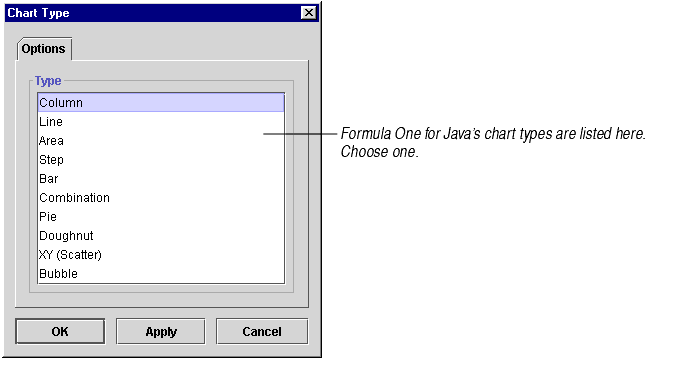
The chart type determines what it will look like: whether the data is displayed as columns, lines, pie slices, etc.
To change the chart type:

|
Area charts show each cell's data as a point on a horizontal line that is the upper boundary of an area that reaches down to the X axis. Use area charts to represent accumulation of value over a period of time. An area chart focuses on the magnitude of change rather than the rate of change. For information, see About Area Charts. |

|
Bar charts show each cell's data as a horizontal bar. Bar charts compare items to each other and are particularly effective at showing large changes from one category to another. They are equivalent to column charts turned on their side. For information, see About Column and Bar Charts. |

|
Bubble charts show two groups of numbers as a series of XY coordinates. In addition, a third set of numbers indicates the size of each datapoint, or bubble. Bubble charts can be used to show the relatedness of data as well as the relative importance of each datapoint. They are like XY (Scatter) charts with an added third dimension. For information, see About Bubble Charts. |

|
Column charts show each cell's data as a vertical column. Column charts compare items to each other and are particularly effective at showing large changes from one category to another. For information, see About Column and Bar Charts. |

|
Combination charts let you display different types of data in different ways on the same chart. You may combine columns, lines, areas, and steps. Use them to visually highlight the differences between different sets of data. For information, see About Combination Charts. |

|
Doughnut charts show each cell's data as a slice of a doughnut. The chart may contain one or more doughnuts, arranged one inside the other. Doughnut charts show the relationship of parts to the whole of several sets of data. For information, see About Doughnut Charts. |

|
Line charts show each cell's data as a point on a line. They illuminate trends or changes in data over a period of time. They emphasize time flow and rate of change rather than amount of change. For information, see About Line Charts. |

|
Pie charts show each cell's data as a slice of a pie. The chart may contain one or more pies. Pie charts show the relationship of parts to the whole. For information, see About Pie Charts. |

|
Step charts show each cell's data as a stairstep in a series of stairsteps. Like area charts, they show data accumulation, only they illustrate changes between data points as distinct stair steps rather than as continuous points. Use them to compare items that do not show trends. For information, see About Step Charts. |

|
XY (Scatter) charts plot two groups of numbers as a series of XY coordinates. XY charts show the relationship between two sets of data. If the data points form the shape of a line, the two sets of data are related. For information, see About XY (Scatter) Charts. |