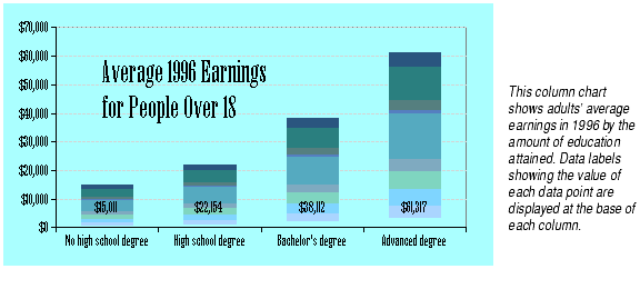
Column charts show each cell's data as a vertical column. Column charts are particularly effective at showing large changes from one category to another.
Bar charts show each cell's data as a horizontal bar. They are equivalent to column charts turned on their side.
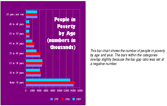
Formula One for Java groups bars on bar and column charts together by category. Each bar displayed in a particular category represents a data point from one series. By default, the bars from different series touch one another within a category, but there is space between categories, as shown in the example bar and column charts above.
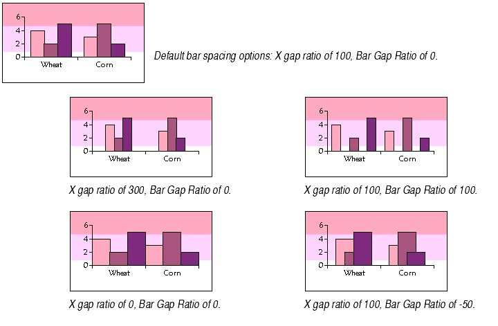
You can change the spacing of the bars on any bar or column chart by using the X Gap Ratio and Bar Gap Ratio options.
X Gap Ratio is the amount of space between categories of bars. By default it is set at 100, meaning that the space between categories is 100% of the width of a bar. You may set it as large as 500, which would be five times larger than the default amount of space, or as small as 0, which would mean the bars in adjacent categories would touch.
Bar Gap Ratio is the amount of space between the bars in a category. By default it is set at 0, meaning there is no space between the bars. Negative Bar Gap Ratio values mean the bars will overlap, while positive values add space between the bars. You may set it as large as 100, which would make the width of the space equal to the width of the bars, or as small as 0, which would superimpose the bars in a category one on top of the other.
To set bar spacing for a bar or column chart:
For charts that display a lot of data in a limited amount of space, you may want to display a line instead of a bar.
To display bars as lines on a bar or column chart: