XY (Scatter) charts plot two groups of numbers as one series of XY coordinates. XY charts show the relatedness of two sets of data. If the data points cluster or bunch in a certain configuration -- for example, if they tend to form the shape of a line -- that indicates that the two sets of data are correlated in some way.
Each marker represents a data point. Each data point must have two pieces of data related to it: its X coordinate and its Y coordinate.
XY charts can have more than one series. Data points in one series all have the same marker style. By default, Formula One for Java connects the markers in a series with a line.
XY charts should be used when you want to compare two sets of values for each series. If one of the two sets of data falls into categories in which you have one entry per category (for example, a statistic that happens every year or for every age group), that data is better served appearing as categories on a different type of chart.
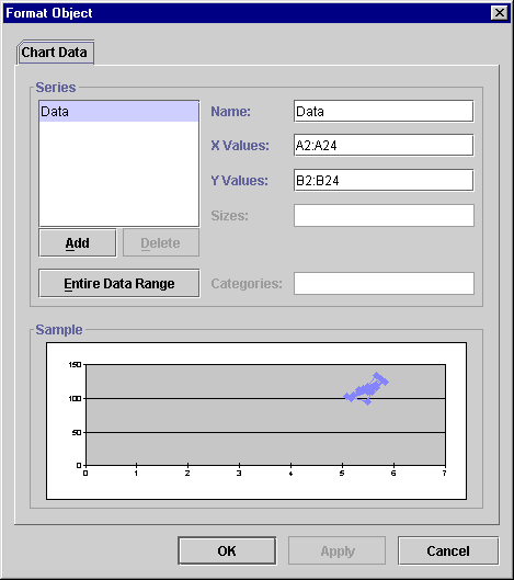
Because the data for XY charts can be arranged in various configurations, Formula One for Java cannot create XY charts automatically. It needs user input to define how the data should be used. To create an XY chart, you first create a "mock" chart using a sample data range. Then you bring up the Chart Data tab to redefine how the data should be used in the chart.
To create an XY chart:
Line connecting the markers. By default, XY charts are drawn with a line connecting all of the markers in a series. You can remove the line by selecting the series of data points, choosing Format Series from the context menu, and clicking Transparent on the Line Style tab. For more information, see Changing Line Styles and Colors.
Labeling the data points. You may label one or all of the data points in a series with automatic data labels that show either the X or Y values or with custom data labels you enter yourself. To label the data points with the X values, choose Category on the Data Labels tab. Strictly speaking, the X axis in this case is a value axis, not a category axis, but the Data Labels tab does not reflect this distinction. For more information, see About Data Labels.