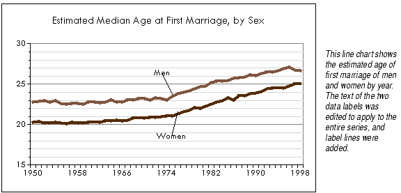
Line charts show changes in data with a fluctuating line. Each cell's data is a point. A series of data points is connected by a line. Line charts are effective at showing trends or changes in data over a period of time. They emphasize time flow and rate of change rather than amount of change.
Line charts show values along the vertical Y axis and categories along the horizontal X axis.
High-low lines link the highest data point of all series in a category to the lowest data point of all series in a category. High-low lines are often used on stock charts to show the highest and lowest price of the stock. Formula One for Java draws high-low lines on all categories of a chart.
After displaying high-low lines, you may select them and change the line color and/or style. For information, see Changing Line Styles and Colors.
To add high-low lines to a line chart:
Drop lines begin at the highest data points on the chart and drop all the way down to the X axis. Drop lines can help link the data point to its category on series with many categories. They are often used on stock charts. Formula One for Java draws drop lines on all categories and all series of the chart.
After displaying drop lines, you may select them and change the line color and/or style. For information, see Changing Line Styles and Colors.
A line chart with drop lines, no markers, and transparent lines looks the same as a column chart with one series displayed with the Show Bar As Line option turned on. Both show lines descending from data points to the X axis. The difference is, drop lines descend from the highest data point of all the series displayed on the chart, while the Show Bar As Line option applies to a particular series of data points. Choose between the two options based on whether you want to use a line or column chart and on how many series you want to display. For more information on the Show Bar As Line option, see Showing Bars as Lines.
To add drop lines to a line chart:
Open-close bars link the data points in the first series displayed on the chart to the data points in the last series. Open-close bars are often used on stock charts to show the prices at which the stock opened and closed the trading period. Formula One for Java draws open-close bars on all categories.
Note Open-close bars will display properly only if the series of data points representing the open and close are the first and last series on the chart. If your data range is not set up like this, you can change the order of the chart series in the Options tab of the Format Series dialog. For more information on changing series order, see Changing the Order of Chart Series.
To add open-close bars to a line chart:
After displaying open-close bars, you may change their fill and line color. You can color the bars and their outlines differently depending on whether the value of the data point in the first series was higher or lower than the data point in the last series. On a stock chart, the two colors would indicate periods when the opening price was higher and periods when it was lower than the closing price.
You also may change the width of the open-close bars.
To change open-close bar fill and line colors:
To change the width of open-close bars:
Stacking series. Stacked series on a line chart don't look any different than un-stacked series. There is no visual cue to let the viewer know that the data points on the lines at the top of the chart represent the sum of that data point and all data points below it.
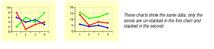
Stacking series on line charts should be done with care to avoid misleading the viewer. For information on how to stack series, see Stacking Series of Data Points.
Plotting series as percentages. When you plot data in line charts as percentages, the top line on the chart appears flat against the upper boundary of the chart plot. This is correct because the top series represents 100% of all the data points in the chart. For information on plotting data as percentages, see Plotting Data Points as Percentages of the Category.