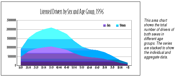
Area charts show each piece of chart data as a point on a horizontal line that is the upper boundary of an area that reaches down to the X axis. Use area charts to emphasize the relative importance of values over a period of time. An area chart focuses on the magnitude of change rather than the rate of change.
A series of data appears as a colored area on an area chart. Each series has its own color. Categories are represented by points where the upper bounding lines bend.
Selecting data points. You can't select individual data points in area charts; you may only select the whole area.
Edge of the plot is visible. Since the data points for each category are plotted in the center of that category's portion of the axis, an empty strip of the chart's plot will be visible on both sides of the chart.
Hidden data points. Depending on the chart's data, it's possible to inadvertently hide some or all of the data points of one series behind another series. You can fix this problem in several ways: