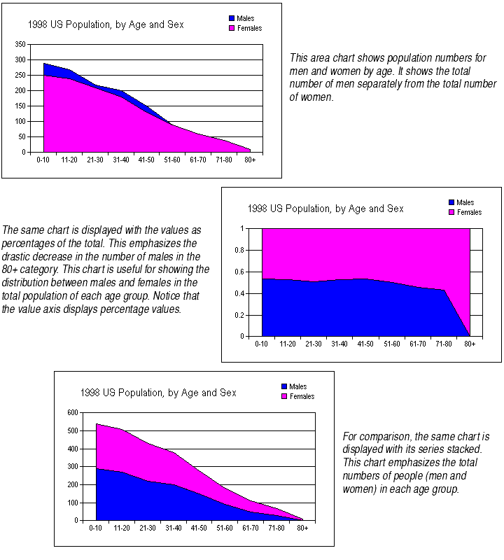
For area, bar, column, line, and step charts, by default each series of data is plotted starting from the X axis. This means the data points are shown on an equal footing with each other, each its own distance from the X axis.
You may choose to display each data point as a percentage of the total of all data points for that category. This means that the series will appear one on top of the other, and the total of all the series will fill the entire chart's plot. The value axis will be adjusted to show values from 0 to 1.

The percentage breakdown is done by totalling all data points in a category, then finding the percentage of that total for each data point. While each category total will be different, each will be displayed as 100%. It is as if you took the data displayed in the third chart shown above and stretched it upwards so the upper bounding line were a straight line parallel to the X axis, while keeping the proportion of the two areas the same. The result is the second chart shown above.
Series plotted as percentages automatically appear one on top of the other. You do not have to choose the Stacked option to achieve this effect.
To plot data points as percentages of the category total:
Chart types. As mentioned earlier, you may plot series as percentages on area, bar, column, line, and step charts. On bar and column charts, the series are offset from one another, as shown in the example for Stacking Series of Data Points.
Appropriate types of data. This type of chart should only be used when the chart contains two or more series that contribute to a total. A chart with just one series displayed as a percent of total displays each data point as the total. Also, displaying series as percentages may be misleading on charts whose series add up to less than the total (for example, sales figures for quarters 1, 2, and 3 but not quarter 4), unless you note that these are percentages of part of the total.
Percentages on the value axis labels. The value axis labels displayed on a chart plotted as percentages will show values from 0 to 1. You can change the number format of the axis labels to show percentage values with trailing percent signs. For more information, see Changing Number Formats.
Preset value axes. When you plot series as percentages of the category totals, Formula One for Java automatically adjusts the chart's value axis to display percentage values from 0 to1, as shown above. However, if you have previously adjusted the value axis scale so that it is no longer automatically scaled, the settings you chose for that axis remain. The data will display between the 0 and 1 values of the current value axis. If the Maximum value is large (in the hundreds or thousands), the chart data may not even appear on the chart, since the space between the 0 and 1 values on such an axis is tiny. In this case, it's best to set the value axis scale to Automatic. For more information on scaling value axes, see About Axis Scale.
Applies to all series and studies. When you plot series as percentages of the category totals, you do so for all of the series on a chart. You may not plot some series as percentages and plot others as values. This also applies to charts with studies and second Y axes: If you plot the series on the main chart as percentages, series displayed on studies will appear as percentages as well.
