To create a chart, first select a range of cells on a Formula One for Java worksheet. That range, called the data range, is linked to the chart. You may later redefine what data is linked to that chart.
For information on how Formula One for Java interprets the data in a chart's data range, see Anatomy of a Data Range, Headings in the Data Range, and Editing Cells in the Data Range.
For information on redefining the data that was originally linked to the chart, see Changing the Chart's Data Source.
Note Bubble, XY, and stock charts require the data in the data range to be organized in a specified arrangement, otherwise the chart will not display the data properly. For more information on bubble charts, see About Bubble Charts. For more information on XY charts, see About XY (Scatter) Charts. For more information on stock charts, see About Stock Charts.
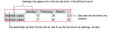
The data range can contain headings, data, and a spaceholder cell.
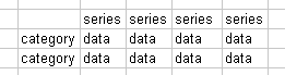
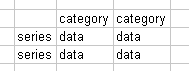
Headings are text cells that are used as names for categories and series on the chart. You do not have to enter headings, but if you do, they may only appear in the top row and/or left-hand column of the data range.
Data are number cells that are used as data points on the chart. Numbers may fill the entire data range if you choose not to enter headings.
The spaceholder cell is an empty cell in the top left corner of the data range. Use the spaceholder cell only when the top row AND left-hand column of the data range contain headings. The spaceholder cell tells Formula One for Java to use the data in the first column as headings. If the upper left-hand cell contains text or numbers, the cells in the leftmost column will be considered data cells and will be plotted on the chart.
If any cell in a non-heading row or column contains text, that text will be plotted as 0 on the chart. If any cell in a non-headings row or column is empty, no data point will appear on the chart and the space reserved for that data point will be blank.
Note You create this kind of data range when you set up the chart for the first time. After creating the chart, you may change the cells or ranges linked to each heading, to each range, or to the entire chart. See Changing the Chart's Data Source.
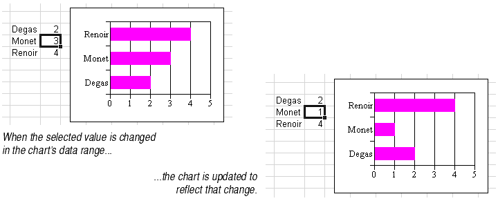
When you change the contents of a cell in the data range, the chart is automatically updated.
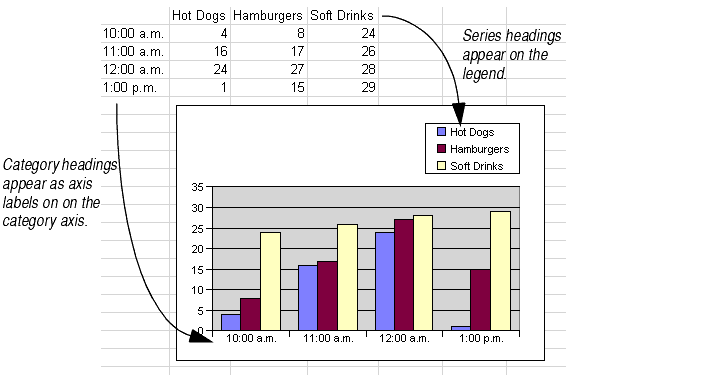
By default, category headings in the data range are used as axis labels on the X (category) axis. Series headings in the data range are used as series labels in the chart's legend. To change the category axis label text, change the contents of the heading cell. Similarly, to change the text of the chart's legend, change the contents of the heading cell.
When the data range has no headings, Formula One for Java draws a chart that uses numbers for category and series names. By default, each category name will be a number starting at 1 and Series 1, Series 2, etc. will appear in the legend.
Data range heading cells must contain text. If you want your heading to be a number, either enclose it in quotation marks or precede it by a tick mark (').
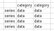
Headings may only be entered in the top row and/or left-hand column of the data range. Text entered in other cells of the data range is plotted as a zero value on the chart. If you enter headings in both the top row and left-hand column, you must leave the top-left cell in the range blank.
Note Pie charts, doughnut charts, and charts with varied data point colors display category headings, not series headings, in the legend. For more information, see About Pie Charts, About Doughnut Charts, or Automatically Varying Data Point Colors.
By default, the number of rows and columns in the data range determines how the chart defines categories and series. Formula One for Java will follow the default guidelines the first time it draws a chart based on the data range you select. Later, you can change these default settings (see Different Ways to Define Series and Categories below).
A rule of thumb: the charting software always tries to minimize the number of series on a chart. It counts the number of rows and columns in the data range and assigns series to the smaller of the two counts. As noted above, if the row and column counts are equal, then by default each row becomes a series.
Note Pie and doughnut chart types use series and category data differently than the other chart types. For more information on pie charts, see About Pie Charts. For more information on doughnut charts, see About Doughnut Charts.
For most chart types, chart data is organized into series and categories that correspond to rows and columns on the data range. Each chart type displays series and categories differently.
| Chart type | A series is displayed as... | A category is displayed as... |
|---|---|---|
| Area | A colored area | A point where the upper bounding lines bend |
| Bar | Bars of the same color | A group of bars, one from each series |
| Bubble | Bubbles of the same color | A bubble |
| Column | Columns of the same color | A group of columns, one from each series |
| Combination | One of four options: | One of four options: |
| Doughnut | A doughnut | Doughnut slices of the same color |
| Line | A colored line | A point where the lines bend |
| Pie | A pie | Pie slices of the same color |
| Step | A colored "staircase" | A set of platforms, one from each staircase |
| XY | A colored line | A point where the line bends |
For information on how to enter and identify series and categories in the chart's data range, see Working With Chart Data Ranges.