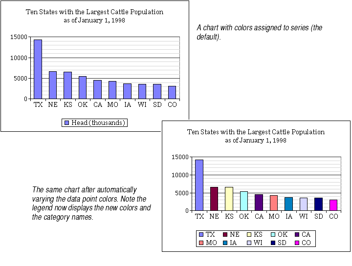
By default, Formula One for Java displays all of a series' data points in the same color. This means that all data points on charts with a single series appear in the same color.
You may automatically vary the colors of bars and lines on charts within one series so that each bar or each line between data points appears in a different color. When you make this change, the colors of the data points automatically change. The legend also changes to show the new colors and the category names instead of the series color and series name.
This option only works for charts with one series.
This option is only available on charts where series appear as bars and lines. That is, this option is available on column, line, and bar charts, on column and line series in combination charts, and on XY charts that display lines between the data points.
The colors displayed on data points are the automatic system colors for charts.
To automatically vary data point colors in a series:
Other ways to change data point colors. You may select individual data points and change their colors. You may do this whether the series colors are varied or not. For more information about changing data point colors, see Changing Fill Colors, Patterns, and Gradients.
Changing the chart type. If you choose the Vary Colors option and then change the chart type, the color change you made is ignored and the series will revert to the default colors.
Adding a series. If you choose the Vary Colors option and then add a series to the chart, the color change you made will be ignored and each series will revert to its default color.
Pie and doughnut charts. On pie and doughnut charts, Formula One for Java's color default is exactly the opposite of the other charts' color default: It automatically varies the series colors. This is because each series is plotted as one pie or doughnut on the chart. If one color applied to each series, each pie or doughnut would be all one color. Therefore, for pie and doughnut charts, changing the Vary Colors check box has exactly the opposite effect as described here. For more information, see About Doughnut Charts and About Pie Charts.