The scale of an axis is the units into which the axis is divided. The units are marked by ticks, labels, and grid lines. When you change an axis' scale, you change how the ticks, labels, and grid lines will display.
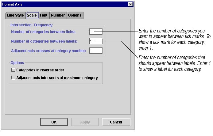
The scale of a category axis is very simple: Each category is one unit. The axis is divided into the same number of units as categories. The only choices you have for category axis scale is whether and how often to display axis labels, ticks, and grid lines.
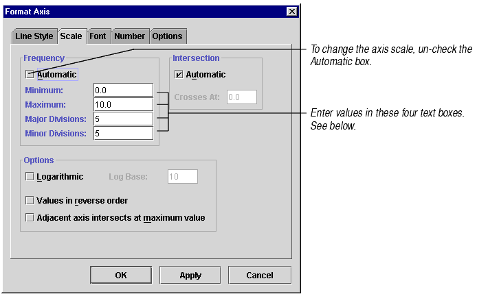
The scale of a value axis is more complex because you have to choose minimum and maximum axis values and determine where the divisions between the maximum and minimum should fall.
When you create a new chart that uses axes, Formula One for Java automatically assigns a scale to that chart's value axis by using an internal algorithm to configure four axis scale settings. All of these settings are based on the data in the chart. You can later change these settings. The settings are:
Maximum is the highest value shown on the axis. When the axis is automatically scaled, Maximum is set at a value higher than the largest data point on the chart.
Minimum is the lowest value shown on the axis. When the axis is automatically scaled, Minimum is set at a value lower than the smallest data point on the chart.
Major divisions are the largest units into which the axis is divided. An axis ranging from 0 to 100 might have major divisions at every 10 units. Major divisions are marked by axis labels. You may also choose to mark major divisions with ticks and major grid lines.
Minor divisions are sub-units of the major divisions. An axis with major divisions every 10 units might have minor divisions every 2 units. You may choose to mark minor divisions with minor grid lines.
To change the scale settings of a category axis:
To change the scale settings of a value axis:
Note Setting axis scale options establishes where ticks and major and minor grid lines should appear on the chart, but it does not determine whether or not they are displayed. For information on how to display ticks, see About Ticks. For information on how to display grid lines, see Showing and Hiding Grid Lines.