Bubble charts show two groups of numbers as a series of XY coordinates. A third set of numbers indicates the size of each datapoint, or bubble. Bubble charts show the relatedness of three different sets of values.
Each bubble must have three pieces of data related to it: its X coordinate, its Y coordinate, and its bubble size. Bubbles in one series are all the same color. You may have more than one series of bubbles on a chart.
Bubble charts should be used when you want to compare three sets of data for each series. If one or more of the three sets of data falls into categories in which you have one entry per category (for example, a statistic that happens every year or for every age group), that data is better served appearing as categories on a different type of chart.
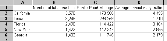
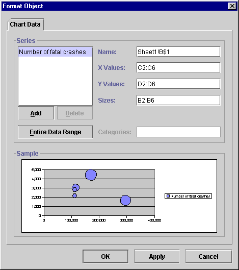
Because the data for bubble charts is complex and can be arranged in various configurations, Formula One for Java cannot create bubble charts automatically. It needs user input to define how to interpret the data. To create a bubble chart, you first create a "mock" chart using a sample data range. Then you bring up the Chart Data tab to redefine how the data should be used in the chart.
To create a bubble chart:
Formula One for Java sizes the bubbles proportionally. To set the starting point for sizing bubbles, Formula One for Java uses an internally computed default size. You can increase or decrease this default size to increase or decrease the size of all of the bubbles on the chart.
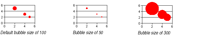
To change the relative sizes of all the bubbles on the chart:
A special data label formatting option for bubble charts allows you to display the bubble sizes in data labels.
To display data labels showing bubble sizes on a bubble chart series:
Note The Data Labels tab also appears on the Format Plot and Format Data Point dialogs. This allows you to apply data labels showing bubble sizes to all the series on the plot or to just one selected data point. For more information, see About Data Labels.
Overlapping bubbles. If two or more data points have similar X and Y values, the bubbles may overlap, or one may be hidden behind another.
If the overlapping bubbles are two different colors, they are from two different series. You can fix the overlap by rearranging the order of the chart series. For information, see Changing the Order of Chart Series.
If the overlapping bubbles are the same color, they are from the same series. You can fix the overlap by rearranging the order of the rows in the chart's data source on the worksheet. Formula One for Java draws the bubbles in the order in which they appear on the worksheet, with the data in the higher worksheet rows drawn first and the data in the lower rows drawn on top of the earlier data. You can copy and paste the rows so that the data for the hidden bubble now appears in the bottom row.
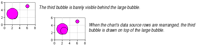
The hidden bubble should automatically appear on top of the other bubbles. For information on copying and pasting worksheet cells, see Moving, Copying, and Pasting.
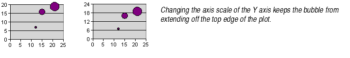
Bubbles extending off the plot. If the bubble size of a bubble located near the edge of the plot is large, part of that bubble may extend off the edge of the plot, as shown below. You can fix this problem by adjusting the axis scale in the Scale tab of the Format Axis dialog. For more information about adjusting axis scale, see Changing Axis Scale Settings.