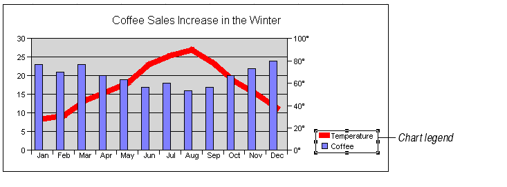
A chart legend appears by default when you first create a chart. For most charts, legends show the names and colors of each series of data. The legend text is taken from the chart's data range.
To add or move a legend:
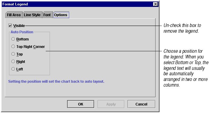
You may also move a legend by clicking and dragging. For information, see Moving Chart Elements.
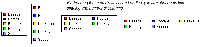
You may size the legend by selecting it and dragging its selection handles. Making a legend longer adds extra space between the lines of text. Making it shorter cuts off lines of text. Making a legend wider will arrange the legend text in multiple columns. Shrinking the legend too far may cut off some of the legend's text.
By default, the legend text is taken from the chart's data range. You cannot select the legend text and edit it directly in the legend. Instead, you change the text in the cells on the chart's data range that correspond to the legend entries. The legend will automatically be updated to reflect the data range changes. For information, see Headings in the Data Range and Editing Cells in the Data Range.
There are other, more complicated ways to automatically change what appears in the legend. For information, see Changing Chart's Data Source for Series and Headings and Automatically Varying Data Point Colors.
| To make this change... | See this section |
|---|---|
| Change the legend font | Changing Fonts, Font Styles, and Font Colors |
| Add a background color | Changing Fill Colors, Patterns, and Gradients |
| Change the outline color | Changing Line Styles and Colors |