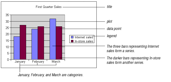

The title is a text box you can place anywhere on the chart.
The plot is the area on the chart that displays the data in the chart type you choose.
A data point is one piece of data appearing on the chart. For most chart types, each data point shows the value of the contents of one cell in the data range linked to the chart.
A chart's legend shows what kind of data is represented in the chart. By default, the text that appears in the legend is taken from the chart's data range.
Series are sets of related data. A chart can have one or more series. Each chart type displays series differently. Often (but not always), series correspond to rows of data in the data range.
Categories are "bins" into which the data from each series is sorted. Often (but not always), categories correspond to columns of data in the data range.
For information on series and categories, see Headings in the Data Range and How Each Chart Type Displays Series and Categories.

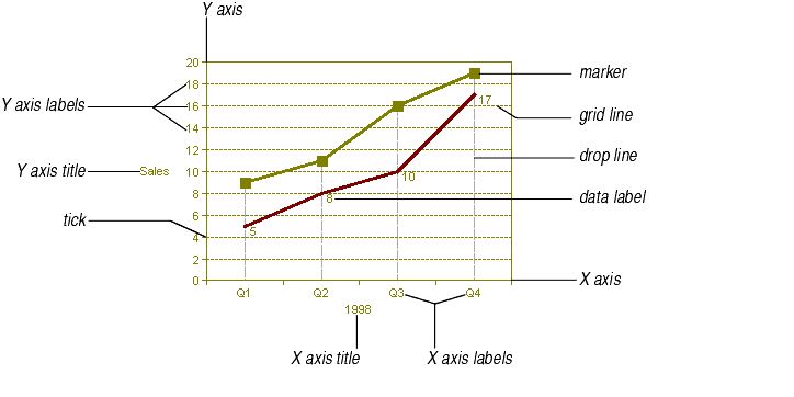
The Y axis is vertical on most charts (except for bar charts, where the Y axis is horizontal). Because it displays values, the Y axis is also called the value axis. On XY and bubble charts, both the X and Y axes are value axes.
The X axis is horizontal on most charts (except for bar charts, where the X axis is vertical). On most charts, the X axis is called the category axis because it displays category names.
Axis labels are words or numbers that mark the different portions of the axis. Value axis labels are computed based on the data displayed in the chart. Category axis labels are taken from the category headings entered in the chart's data range.
Axis titles are words or phrases that describe the entire axis.
Markers identify data points. You can put markers on all data points in a series or on only selected data points.
Grid lines are horizontal or vertical lines that extend from the axis ticks.
Drop lines are lines leading from a data point to the category axis. On large or complex charts, drop lines help show which category a data point belongs to. Drop lines are only available on line chart types.
Data labels identify individual data points. Data labels are a good way to emphasize or explain a particular piece of data on the chart. Data labels can display the data point's category, its value, or text you enter yourself.
Ticks are short lines that mark off an axis into segments of equal size. On value axes, axis labels are displayed on ticks. On category axes, axis labels are displayed between ticks.

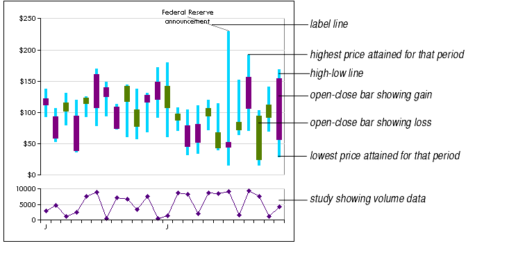
Label lines are lines leading from a data point to its data label.
High-low lines are used on stock charts to show the range of prices the stock commanded over a period of time. High-low lines are available only on line chart types.
Open-close bars are used on stock charts to show the stock's price at market opening and closing. You can color the bars differently to show whether the stock gained or lost.
Studies are sub-charts that display below the main chart in the same plot area. Studies share the same X axis and usually show similar data on a different scale. Stock charts frequently display studies that show the volume of stocks traded. You can display one or more studies on any chart that has axes.
