Problem: How can the artifact indicate that a visual entity represents an action that the user may take?
Forces:
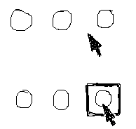
If you change the pointer, use a small picture illustrating what can be done. Use a standard icon if an appropriate one can be found -- crosshairs for drawing, single arrow for selection, I-beam for text entry, hands, pencils, paintbrushes, resize arrows, etc. -- because they are so easily recognized. Keep it small or mostly transparent, so that the user can easily see what's under it.
If you change the thing itself, you have a lot of freedom to experiment. Any visual change may be enough to tell a user that the object is at least clickable; but consider your audience when deciding how flashy or distracting the change is. To be sure that your design actually works, of course, you should test it with potential users.
For those of us stuck with non-tactile interfaces, such as mice, this pattern produces something like a substitute tactile sense. As you run the pointer over the interface, you get visual responses that correlate to physical sensations -- bumpiness (raised button edges), heat (when something turns from a muted color to a bright color), etc. Says David Cymbala:
"I was cruising the web the other day, and I was using the mouse pointer to 'brush' across an image map that had patches of 'active' areas.The image jumped into my mind of what I was doing: "Feeling" the image map with the mouse. Instead of a 'tactile' sensation, I was correlating the image of the mouse pointer with the movement of my hand through space. I almost 'felt' it physically... The pointer allows me to 'feel' visual space as a replacement for the lost tactile dimension." (From personal correspondence, dated June 17, 1998.)Notes: Don Norman brought the term "affordance" into the interface designer's vocabulary with his classic The Design of Everyday Things. In it, he defines an affordance as "the perceived and actual properties of the thing, primarily those fundamental properties that determine just how the thing could possibly be used."
I find that when I'm working quickly, I depend very heavily on the fact that my pointer changes when I'm over a manipulable control; if I want to resize a window, and I move the pointer towards the window edge, I instinctively start the press-drag motion the instant that pointer changes. I don't actually look hard to see if the pointer is over the control. That zone could extend ten pixels beyond the window edge, for all I care. Conversely, it's very hard to deal with direct manipulation if the cursor doesn't change -- I have to pay far too much attention to the screen, and use better fine motion control; and with small controls, there's always this vague uncertainty that the action will succeed.
For some wonderfully bad examples, take a look at the Interface Hall of Shame. Look under the "Visual Elements" section, especially at the Microsoft examples and the first WebZip commentary.
Copyright (c) 1999 by Jenifer Tidwell. All rights reserved.