Less is More
most difficult and important concept
Although we often try to explain too much in a presentation, "be concise" and "keep simple" are the best way to success the presentation. If you present a lot of materials, audience cannot understand. Also when we write a paper, we should focus on the points what we want to derivate. No one wants to read too long papers.
Advisor for my PhD, Roel Snieder, taught me this concept and repeated many times.
"Less is More" is originally come from poem 'Andrea del Sarto' made by Robert Browning in 1855. A part of the original poem is
Who strive - you don't know how the others strive
To paint a little thing like that you smeared
Carelessly passing with your robes afloat, -
Yet do much less, so much less. Someone says,
(I know his name, no matter) - so much less!
Well, less is more, Lucrezia.
Similar quotes:
- Simplicity is the ultimate sophistication (Leonardo da Vinci)
Color blindness
it is not rare
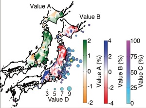
Full color (92%)
Protanopia (2%)
Deuteranopia (6%)
Some of you prefer monochromatic figures, and the others colorful figures. I am basically the latter although I avoid too much unnecessary colors.
If you are the latter like me, you should think about the color blindness because it is not rare (about 4-8% of men based on here
We should use color combination which "all" audience or readers can understand. For example, the journal, Science, recommends us to avoid using combinations of red and green together. The web page in the university of Tokyo is the great reference for color blindness, but if you are not a researcher for color blindness, you do not have to understand all details of the blindness.
To prepare your figures, it is a good idea to convert your color-rich figures to figures of protanopia and deuteranopia, which are the most common types of color blindness, and to check the figures still tell messages what you want to deliver.
How can we convert?
Now, I know only the way to use Adobe Illustrator and Photoshop.
- Illustrator
View -> Proof Setup -> ColorBlindness
- Photoshop
View -> Proof Setup -> ColorBlindness