Doughnut charts show each cell's data as a slice of a doughnut. The chart may contain one or more doughnuts, arranged one inside the other. Doughnut charts let you show the relationship of parts of several sets of data to the whole.
Each doughnut shows a series of data. Slices of the same color belong to the same category. Note that this is the opposite of the way Formula One for Java interprets series and category data on most charts. This means that doughnut chart legends show category labels, not series labels.
Formula One for Java determines the order of the doughnuts by adding the total value of the data points in each doughnut. The doughnut with the largest total goes on the outside, with the progressively smaller doughnuts nested inside the largest, in the order of their total value.
Formula One for Java displays the doughnut slices clockwise in the same order as they appear in the chart's data source.
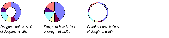
By default, the width of the hole in the center of the doughnut is half the width of the largest doughnut. You may change the size of the doughnut's hole by entering a percentage of the total doughnut width.
To change the size of the doughnut's hole:
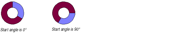
Formula One for Java displays the doughnut slices clockwise in the same order as they appear in the chart's data source. By default, the edge of the first slice starts at 0°, or the 12 o'clock position. You can change the position of that starting edge. All doughnuts on the chart must have the same starting position.
The start angle is expressed in degrees, where 180° is the 6 o'clock position.
To change the start angle of the doughnuts' slices:
You may display the doughnut slices adjacent to one another, as shown in the previous examples, or you may display the doughnut as if cut into pieces, with its slices pulled apart. This is called exploding the slices. You may do this for one or all of the doughnuts on the chart.

As you can see in these examples, exploded doughnut slices are smaller than unexploded slices. They shrink because the doughnut's outside circumference must remain the same size to ensure that it fits on the chart plot.
You cannot pull out just one doughnut slice.
To explode the doughnut slices:
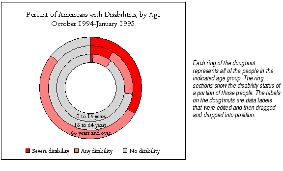
Labeling doughnuts. While Formula One for Java has no automatic option for labeling each doughnut, you can create a data label for a doughnut slice, edit it to display the name you want, then drag it to a new position on the doughnut. You should try to make it clear that the label applies to the entire doughnut. For more information, see About Data Labels.
The Use Weighting check box. While this check box is available in the Pie/Doughnut frame of the Options tab of the Format Plot dialog, it has no effect on doughnut charts. For an explanation of its effect on pie charts, see Changing the Sizes of the Pies.
The Vary Colors option. On the Options tab of the Plot dialog, the Vary Colors option is automatically selected for doughnut charts. This makes each slice of the doughnuts a different color. If you uncheck the Vary Colors checkbox, each doughnut will appear as a different solid color, with the slices delineated by lines. For more information on the Vary Colors option, see Automatically Varying Data Point Colors.