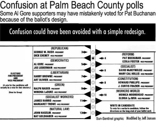

Isn't it conceivable that some voters may have assumed that the second hole corresponded to the second slot on the left, with the Democratic candidates? Unlikely, maybe, but certainly possible. And if someone made the mistake of punching the second hole, and then realized his or her mistake and punched the third one -- that's a perfectly human and understandable response, right? As it turns out, exit polls and anecdotes indicate that a lot of people really did misunderstand the ballot.
Now, the number of people who voted for Buchanan in that county is larger than the margin between Gore and Bush across the state. If a large number of the Buchanan votes were erroneous -- or if a large number of double-punched ballots were thrown out, which seems to be the case -- this design problem may cost Gore the presidency.
That should give you pause.
There have been a lot of news stories and explanations flying around about this issue. They have shown up some very common fallacies about design:
1. If people don't understand it, they'll tell us. Yes, but only if they know they're confused. If they really and truly think that the second ballot hole was Gore's, why should they report that they don't understand it? They do, as far as they're concerned. Among professional designers, self-reporting of usability problems is always suspect; direct observation of users is a much better way to discover problems with a design.
2. The arrows are obvious. All you had to do was follow the arrows. How could that possibly be hard? You'd be amazed, actually, at how easy it is to miss seeing something that's in plain sight -- or to see it consciously, and then go do something else subconsciously. The problem with the ballot is that there is an apparent correspondence between the lefthand slots (first Republican, then Democratic, etc.) and the punch holes; the lefthand/righthand alternation is unusual and unexpected. This is reinforced by the assumption that the two major parties are listed consecutively at the top. The arrows contradict these other two assumptions. Cognitively speaking, it's a mess! Not as bad as your average VCR or microwave, but bad enough.
3. Inspection by stakeholders who aren't design professionals is enough to verify that the design is OK. The Supervisor of Elections in Palm Beach, Theresa LePore, is a Democrat, and she was partially responsible for the design of the ballot. If she had noticed that the ballot layout may have cost her party critical votes, surely she would have said something. But could she see the problem? Probably not, and that wouldn't necessarily be due to incompetence or sinister motives on her part. Instead, the election staff should have had the ballot looked at by a design professional with training in cognitive science and usability techniques. Some design issues are not just "common sense." (If design was all "common sense," the design professions wouldn't exist, and anyone could design the cockpit of a 747.)
It has been said in some circles that testing the design on a representative sample of real voters -- a technique known as "usability testing" -- may have uncovered the problem. This is probably true. It's also likely, however, that a comparatively small percentage of voters actually had trouble: small enough to not show up in a small sample (e.g. 20 people), but enough to affect a large absolute number of people in the end.
4. If people don't read the directions, it's their own fault if they screw it up. This isn't just a fallacy; this is downright immoral. It's utterly uncompassionate. Do we really want to discount the opinions of citizens who are old, or tired, or distracted, or stressed, or just aren't quite up to our level of thinking? Sample ballots were mailed out in advance, but many people may not have have time to look them over. Or maybe they assumed that the voting would be easy (a perfectly reasonable assumption), and that they could figure it out at the voting booth. Or maybe they were illiterate, or didn't speak much English. It's a phenomenon that's well-known among designers: almost no one reads directions in advance, for this or other tasks.
The point is, written instructions are no substitute for decent design. Good design is cheaper in the long run, and much more humane -- it shifts the burden of difficulty off of the hundreds of users (or thousands, or millions) and towards the few people creating the design. In the hands of a design professional, in fact, good design can even be cheap up front. Take a look at this simple ballot redesign, done by Jeff Jansen:

Voting for the President is not rocket science, folks -- it should be simple enough for all our citizens to do it correctly and easily. The people who designed this ballot should take responsibility for the poor design, and a runoff vote (with a revised, clearer ballot) should be held. Otherwise, the people's trust in the voting process will be dangerously eroded.
It makes you wonder, actually, how many other elections have failed to reflect the will of the people because the ballots or voting booths have been poorly designed. We only know about this particular problem because the race was so close, and the stakes so high.
How much has our democracy lost to poor design?